workshop
Farveworkshop
Farveworkshop
Få dybdegående indsigt i farveteori, lysforståelse og tekniker til praktisk anvendelse af farveværktøjer
København 16. marts 2026
workshop
Farveworkshop
Få dybdegående indsigt i farveteori, lysforståelse og tekniker til praktisk anvendelse af farveværktøjer
København 16. marts 2026


Farver i design og arkitektur – en workshop for den professionelle intuition
Farver former mere end flader. De guider adfærd, skaber tilhørsforhold og rammer vores sansning med langt større præcision, end vi ofte erkender. Denne workshop tager farven alvorligt – både som fysisk fænomen og som kulturel konstruktion – og klæder professionelle på til at arbejde mere bevidst, systematisk og strategisk med farver.
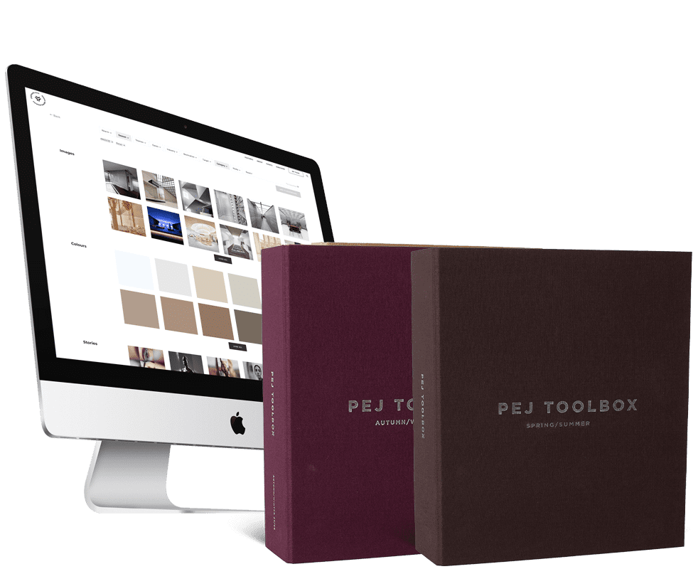
Vi dykker ned i hvordan øjet og hjernen opfatter farver, hvordan farvesystemer som NCS og Pantone forsøger at tæmme det kaotiske, og hvordan vi formulerer og argumenterer for vores farvevalg overfor både kolleger og samarbejdspartnere. Samtidig får deltagerne adgang til et nyt, vidensbaseret farvevalgsværktøj, som kan bruges direkte i praksis.
Formatet er skåret til for professionelle: Vi arbejder i fire fokuserede afsnit – med et samspil mellem viden, diskussion og konkrete opgaver – der tilsammen udgør et robust grundlag for at bruge farver med sikkerhed og gennemslagskraft.
Ved workshoppens afslutning har du
- Opnået kendskab til grundlæggende farveteori og farvesystemer, deres historiske udvikling og anvendelse i design.
- Lært at bruge Pantone-systemet og farveværktøjer til at skabe harmoniske og afbalancerede farvesammensætninger i både mode- og produktdesign.
- Fået indsigt i, hvordan neuroæstetiske principper kan vejlede farvevalg for at skabe følelsesmæssig og sanselig effekt i design.
- Forstået farvers interaktion med forskellige materialer og lysforhold for at opnå ønskede stemninger og funktioner.
- Opnået evnen til at argumentere for farvevalg med naturvidenskabelig evidens, hvilket styrker kommunikationen til kunder og partnere.


Program for the day
1. Farve og fysiologi
Vi lægger ud med det sanselige og det videnskabelige. Hvordan ser øjet? Hvordan tolker hjernen farveinput? Og hvorfor er det relevant? Vi ser på tapper, stave og det trikromatiske syn – og kobler nutidens viden med historiske nedslag fra Newtons og Goethes eksperimenter, Helmholtz’ teorier og George Walds banebrydende opdagelser. Undervejs undersøger vi, hvordan lys påvirker vores oplevelse af farver i praksis.
2. Farvesystemer og deres oprindelse
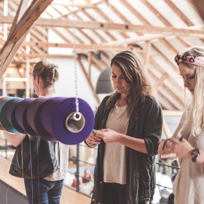
Vi kigger på de systemer, vi i dag bruger til at klassificere og navigere i farver: NCS, RAL, Pantone og andre. Vi trækker tråde tilbage til Aristoteles’ iagttagelser ved solopgang, Newtons spektrale cirkel og Ittens Bauhaus-modeller, men også Ewald Herings og Ogden Roods forsøg på at ordne farver efter menneskets oplevelse. Deltagerne arbejder praktisk med farvesortering og får en konkret forståelse af, hvordan tone, mætning og sorthed fungerer i praksis.
3. Oplevet farve – mellem sans og kultur
Farver er ikke kun målbare – de er også ladet med stemning, betydning og historie. I dette afsnit arbejder vi med sproget omkring farver: Hvordan beskriver vi dem? Hvad betyder det, når noget føles “støvet”, “skarp” eller “kølig”? Vi undersøger forskellen mellem objektive og sanselige beskrivelser, og diskuterer hvordan man kan skabe en anvendelig og troværdig argumentation, når man taler om farver i en professionel sammenhæng.
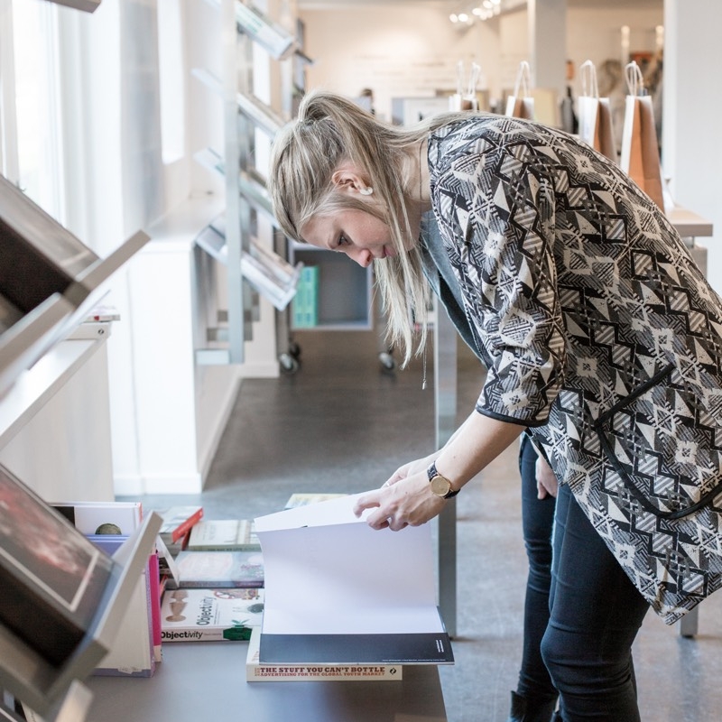
4. Værktøjer og praksis
Sidste afsnit sætter det hele i spil. Vi tester og sammensætter farver, vurderer harmoni og kontrast, og træner os i at navigere mellem intuition og systematik. Vi ser på, hvordan kunstnere og designere arbejder med farver – fra Sanzo Wada og Margrethe Odgaard til KOI Studio og Julie Boserup – og diskuterer hvordan vi selv kan arbejde metodisk med farvevalg i arkitektoniske rum. Der veksles mellem plenum og gruppearbejde, så både individuelle refleksioner og fælles diskussioner får plads.
Afrunding
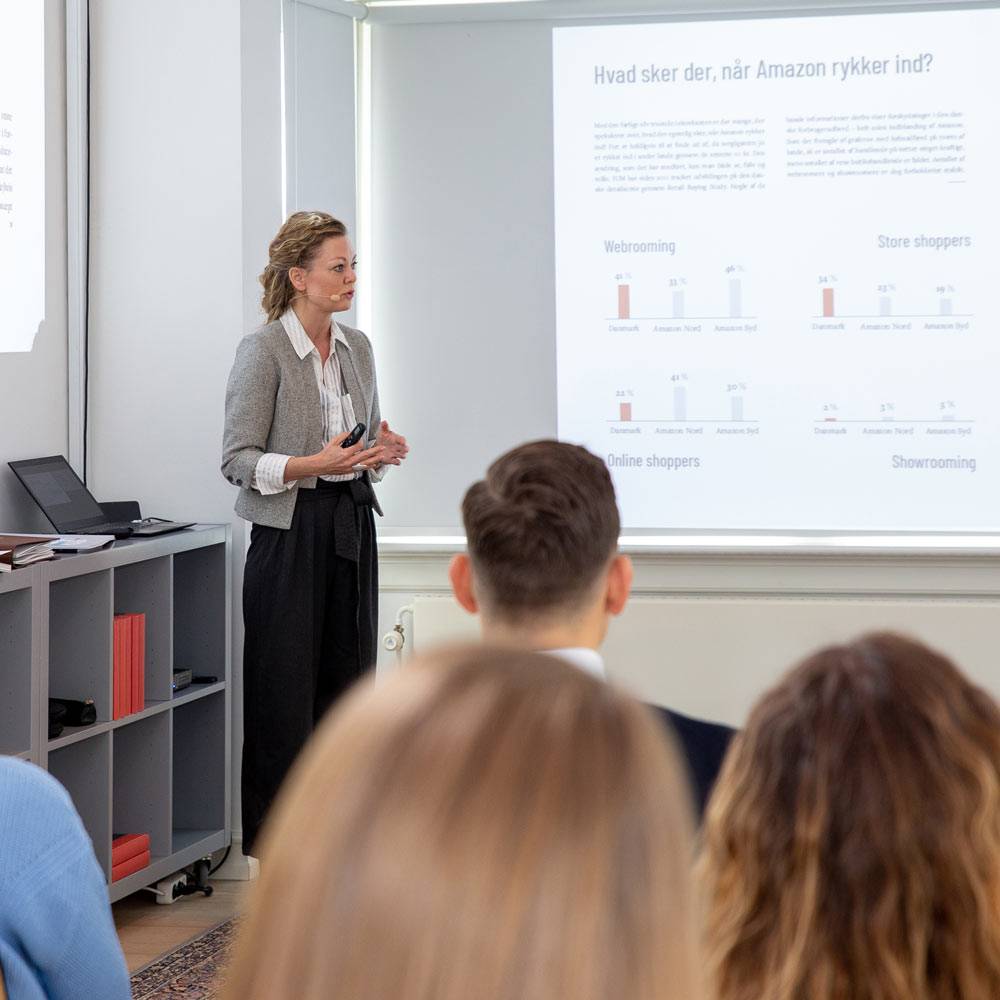
Dagen afsluttes med en fælles opsamling, hvor vi destillerer de stærkeste argumenter og pointer, som deltagerne kan tage med videre i deres praksis – særligt med blik for at kunne formidle og forankre farvevalg i samarbejde med kolleger og beslutningstagere.
Morning
A solid color foundation
Participants share their own experiences with color in design, setting the stage for a shared understanding of how color affects experience and function in different types of design projects.
Presentation on how the brain perceives colors, supported by scientific and historical insights. This explores how colors can create emotional responses and be used to create unity and contrast in design projects.
10:15: Break
10:30: Evolutionary neuroaesthetics and colors (continued)
Review of the NCS system, its conversion to the Pantone system, and their use in conjunction with colour. Participants learn to decode and combine colors so they can create harmonious designs that suit different products and applications.
11:10 a.m.: colour
Understand how light quality affects color perception in design and how different lighting conditions can change the appearance of colors. Inspiration is drawn from Tor Nørretranders and Olafur Eliasson's work with light quality.
Afternoon
Practical work with colors
12:00: Lunch break
Participants are introduced to the newly developed colour, which serves as a practical tool for creating harmonious color combinations. The tool helps participants navigate color choices, contrasts, and balances in both small and large design projects.
The 60/30/10 rule: Participants learn how to use colour to create balanced color compositions, where 60% of the design is dominated by one colour, 30% is supported by another, and 10% is used as an accent.
13:25: Break
Warm and cool colors: Sorting color samples and using colour to understand temperature in color tones and their effect on the design's expression.
Colored spaces and afterimage effects: Inspired by Goethe's experiments, participants explore how afterimages influence the perception of complementary colors and create visual contrasts in design.
Materials and color combinations: Using the color tool and the Pantone system, participants experiment with colors and textures to create harmonious designs.
The effect of light on color tones: Participants test different lighting setups to see how colors change under varying lighting conditions, using colour to help them find the optimal shades.
Apply color theory in practice: Participants use color schemes in their own projects or design assignments, applying what they have learned that day.
Summary of the day's key points and open Q&A with discussion on the application of color principles in design projects of all types.
Om Anders Barslund
Anders Barslund er en erfaren arkitekt med speciale i evolutionær neuro-æstetik og farvelære, hvor han kombinerer forskningsbaseret indsigt med praktiske æstetiske løsninger. Med en 20-årig baggrund i design og renovering af eksklusive boliger i Nordsjælland samt en dyb interesse for, hvordan farver påvirker rumoplevelser, har Anders udviklet metoder, der er lige så anvendelige i store byggeprojekter som i private boliger. Hans tilgang er relevant for arkitekter, der arbejder med omfattende byggerier og ønsker at integrere farve som et strategisk element i arkitektur.


Dine øjne ser i RGB.Rød, grøn og blå.
Din hjerne elsker kontrast, lys og mørke. I fællesskab gør dine øjne og din hjerne dig i stand til at opfatte rum. Så hvordan inddrager du dine menneskelige sanser, når du skal male dit hjem? Det har Anders Barslund øvet sig på at finde rundt i de sidste 25+ år. Her får du en lille smagsprøve på hans arbejde med farver.
Date
København 16. marts 2026
Dinesen Showroom
Søtorvet 5
1371 København
9:00 a.m. to 3:30 p.m.
Aarhus 19. marts 2026
Erhvervsakademi Aarhus (Guldbygningen)
Ringvej Syd 104
8260 Viby J
Lokale: 2.37/2.38
9:00 a.m. to 3:30 p.m.
Price
DKK 3.500,-
per participant for one registered participant.
DKK 3.000,-
per participant with a minimum of two registrants from the same company
Prices shown in Danish kroner are exclusive of VAT. Offers and discounts cannot be combined.
Here's what former participants have to say

“Det var en enorm spændende farveworkshop, hvor man virkelig kan mærke at Anders brænder for emnet. Vi startede helt tilbage til hvordan man i sin tid begyndte at studere farver, og derfra op til nutiden. Efterfulgt af nogle interessante praktiske opgaver, hvor man fik mulighed for at gå mere undersøgende til værks. Det er en workshop, som burde indgå på alle kreative uddannelser!”
“Perfekt balance mellem teori og praksis. Jeg fik en solid forståelse for NCS-systemet, men også indsigt i, hvordan lys og materialevalg spiller sammen med farveopfattelsen. Denne workshop er et must for enhver arkitekt, der ønsker at fordybe sig i farver.”
“Engagerende og transformerende. Anders’ tilgang til farver gør komplekse koncepter tilgængelige, og workshoppen gav mig konkrete værktøjer, jeg kan bruge i store byggeprojekter.”